MEUDNA
meudna's visual identity connects the main brand with a growing ecosystem of products.
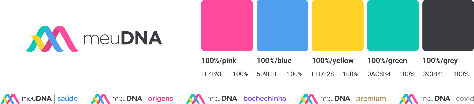
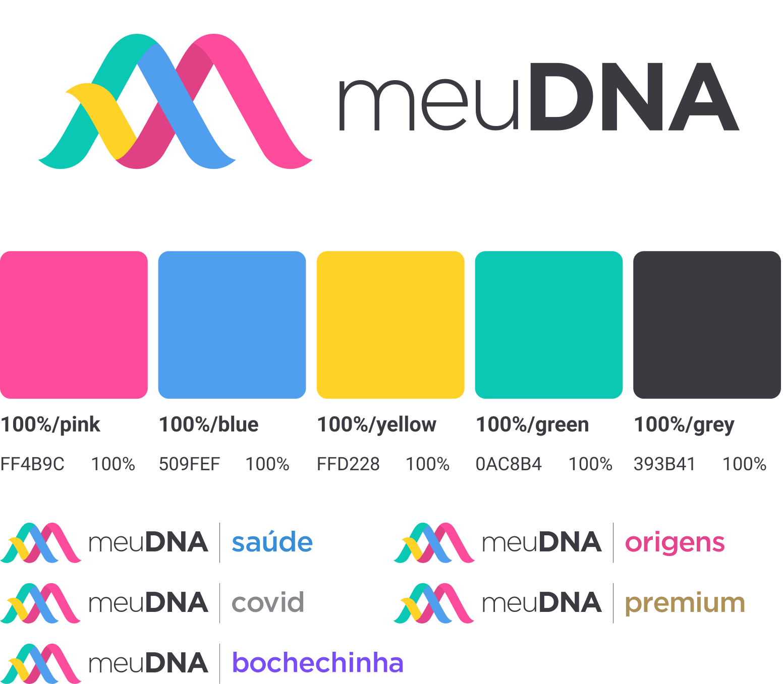
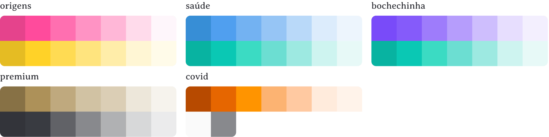
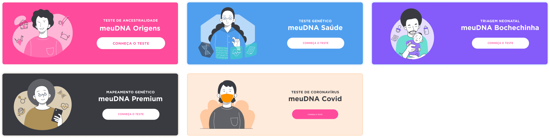
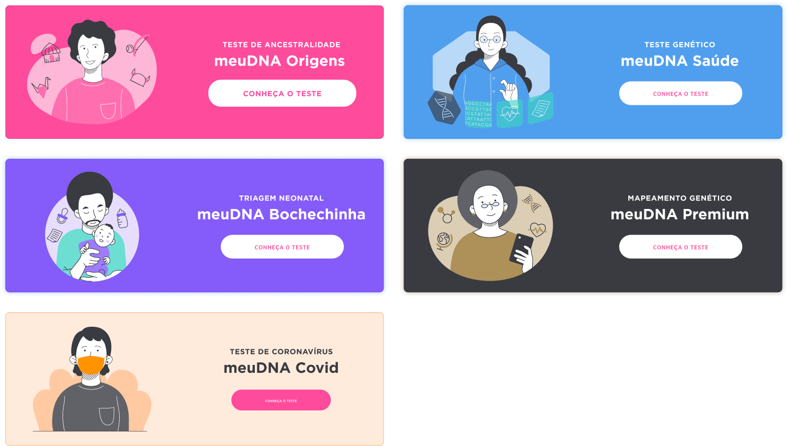
the system includes the primary brand logo alongside five product identities, each supported by its own color series while remaining visually connected to the core palette. this structure allows every product to maintain individuality while staying consistent within the broader brand system.
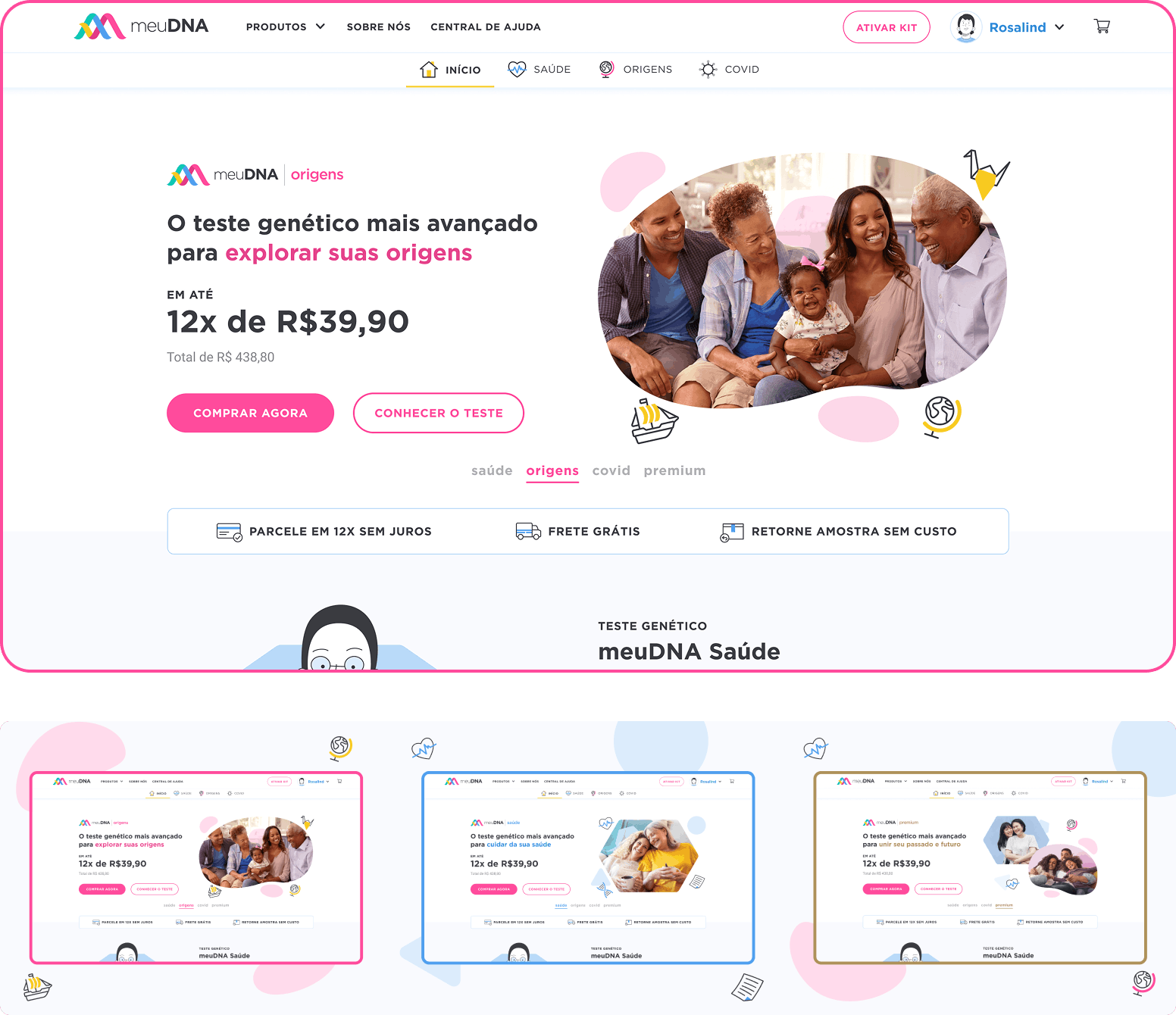
the landing experience introduces the product with clarity and focus.
the hero section introduces the product with a clear value proposition, pricing information, and two primary actions: buy now for direct purchase and Learn about the test for users who want to explore the product details before buying.

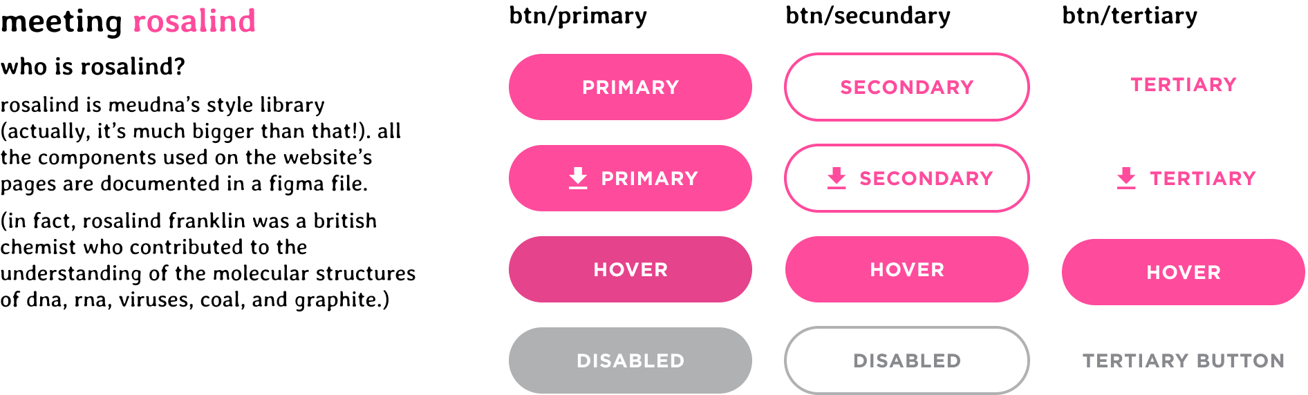
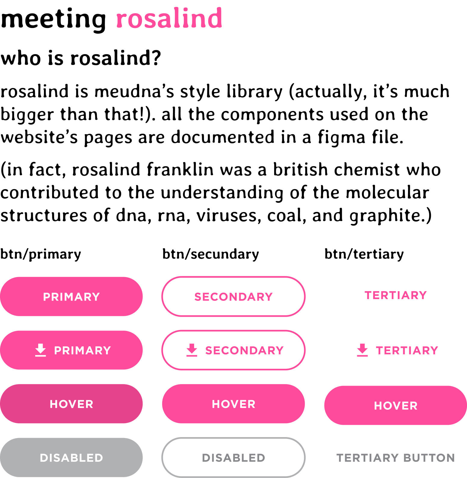
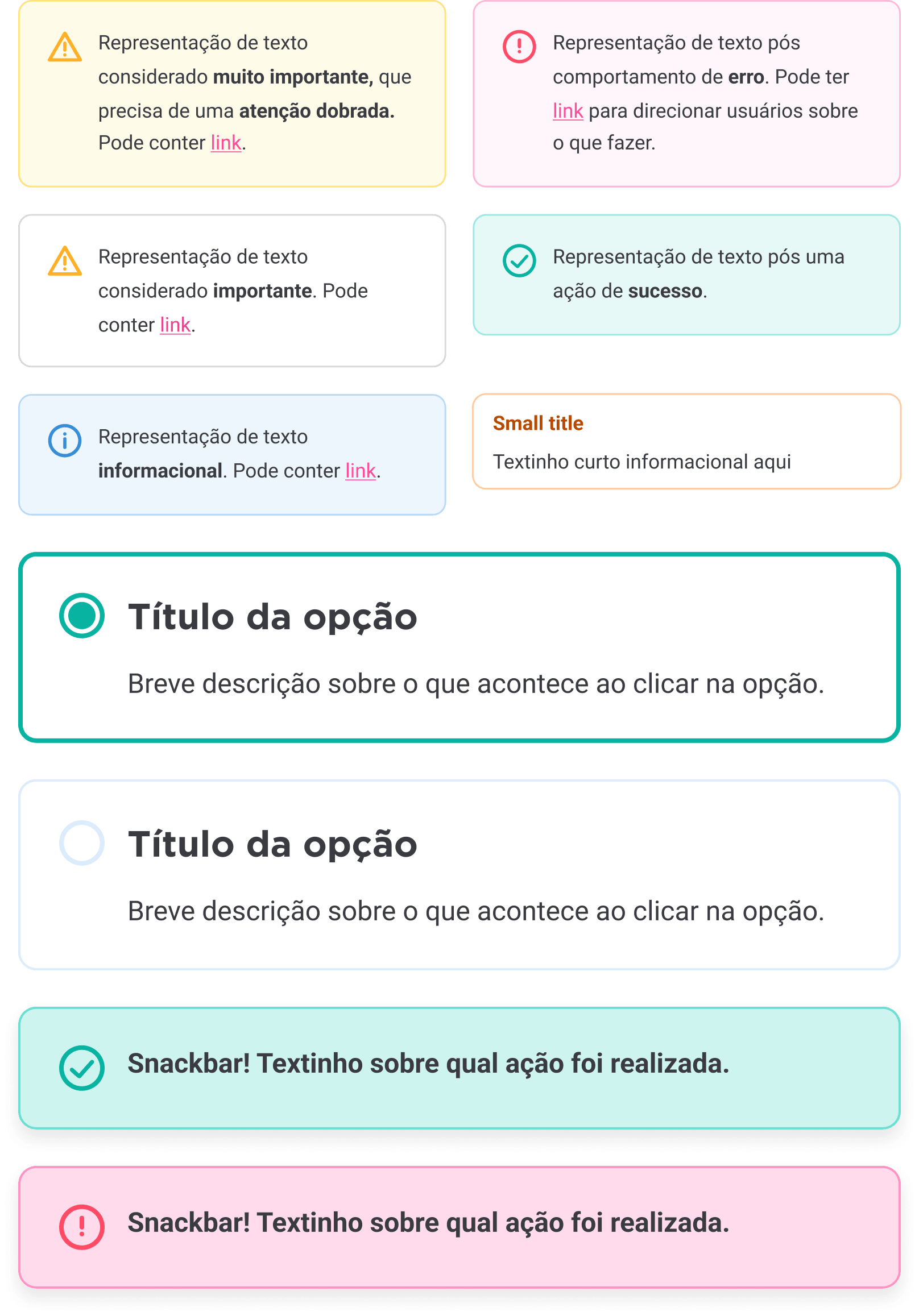
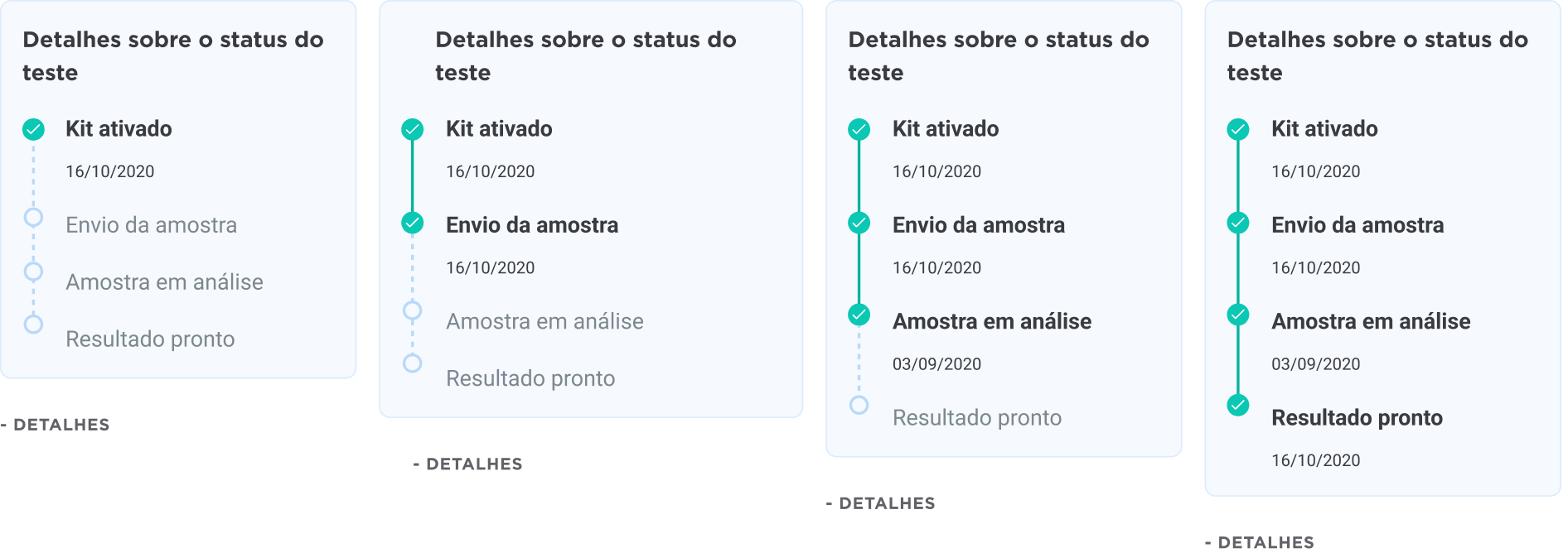
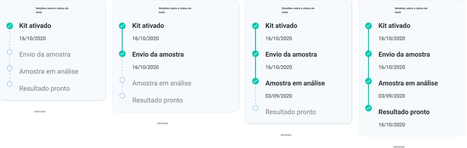
rosalind is the design system created to support the meudna platform and its products.
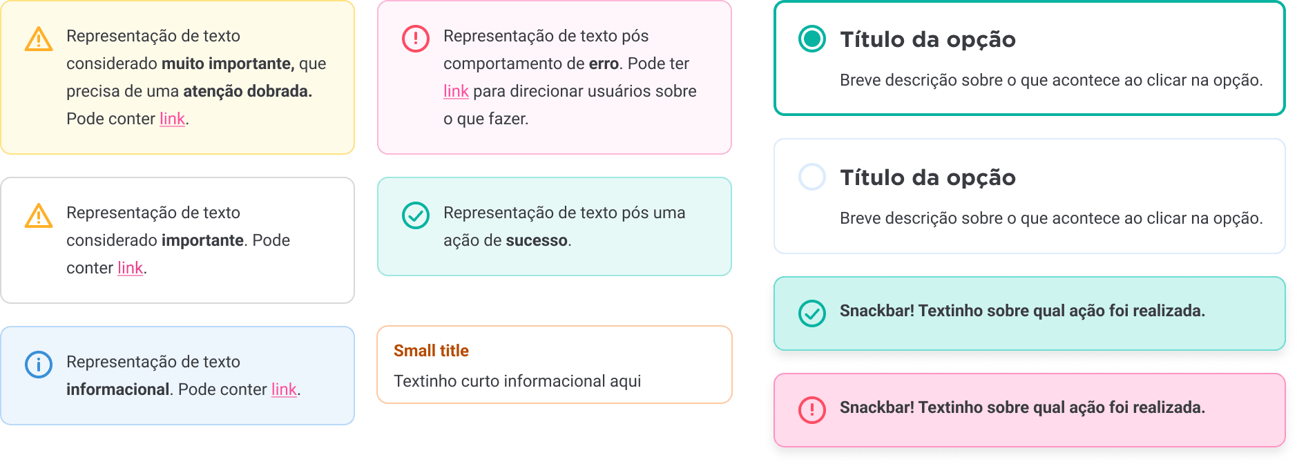
it includes standardized ui elements such as button variations, product cards, alerts, and specialized components like kit delivery status. the system ensures visual consistency across the platform while allowing teams to build new interfaces quickly and reliably.
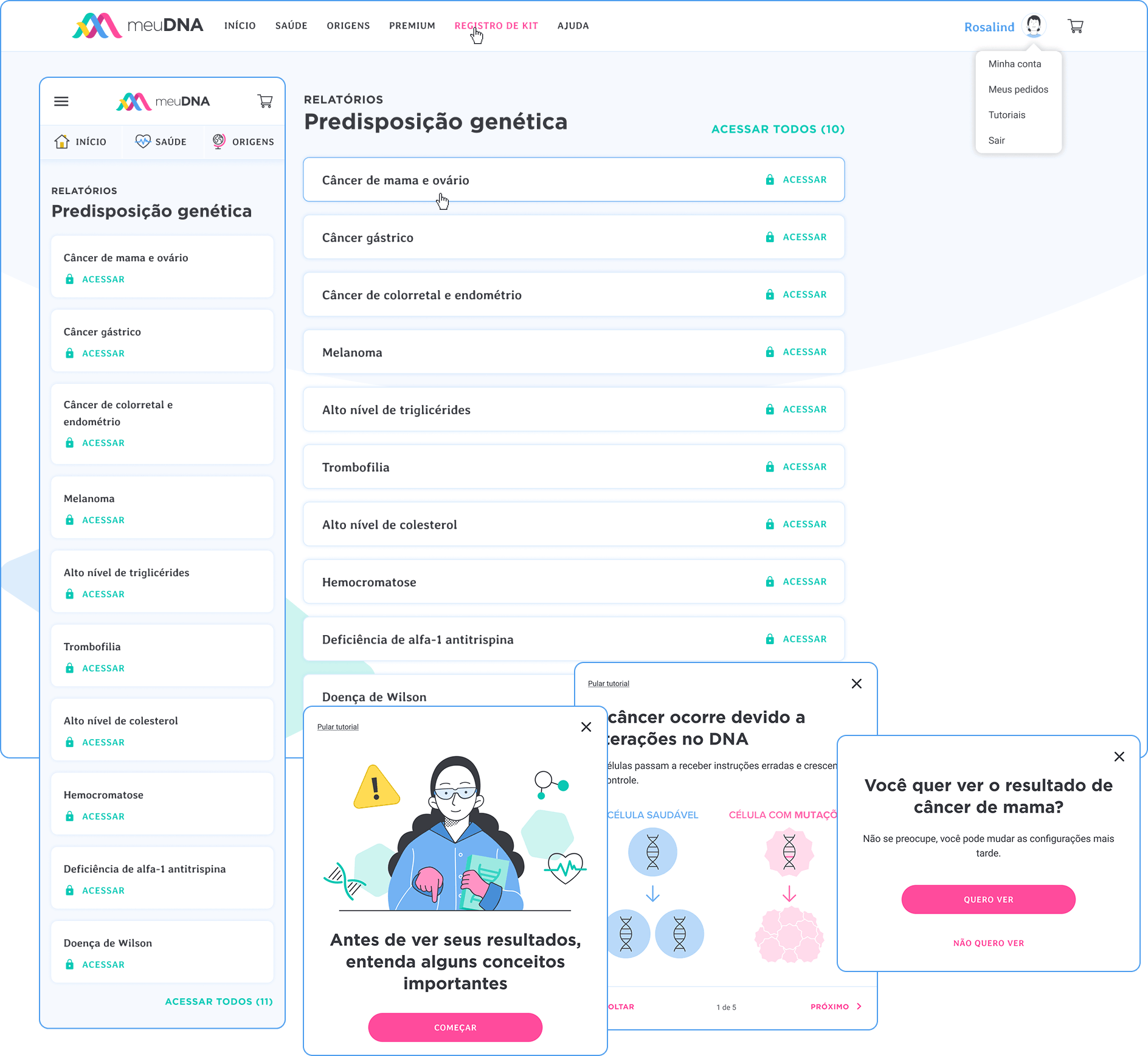
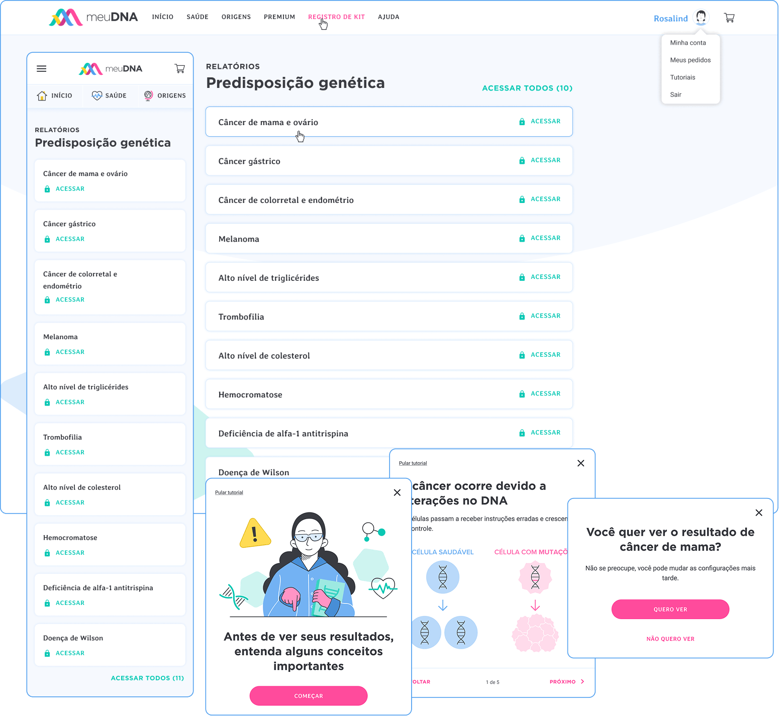
the focus was to present genetic predisposition results in a clear and responsible way.
before accessing their results, users go through a short educational tutorial explaining how genetic predisposition works. this step helps provide context and prevents misinterpretation before showing the health insights related to potential genetic risks.
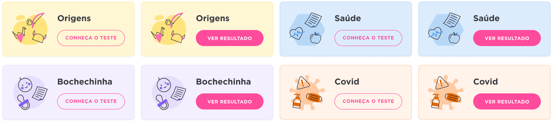
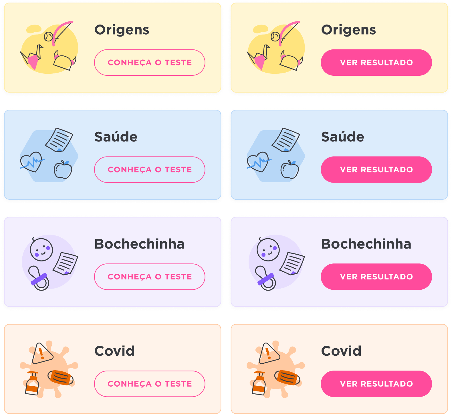
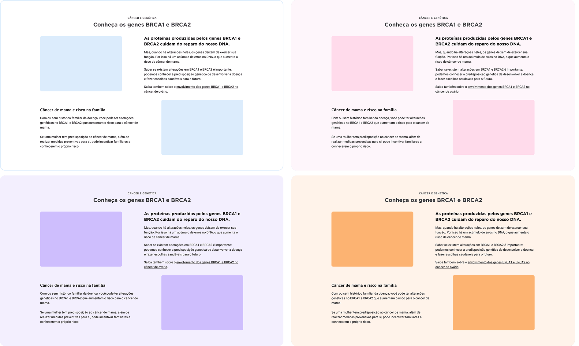
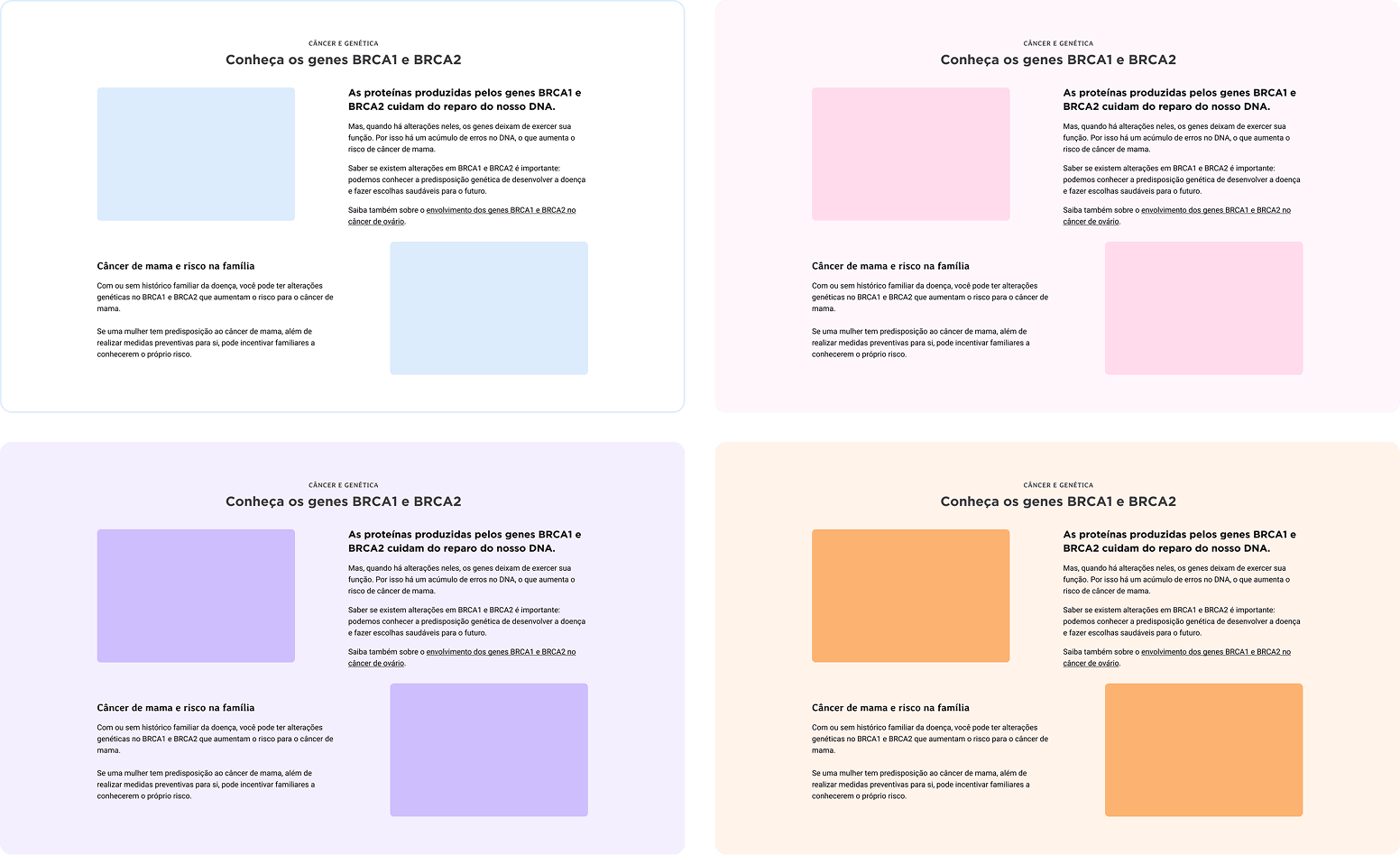
to empower the content team, we created a modular system for building pages without design support.
by defining layout rules, component variations, and color combinations, the system allows writers and marketers to assemble new pages while maintaining visual consistency and brand guidelines.
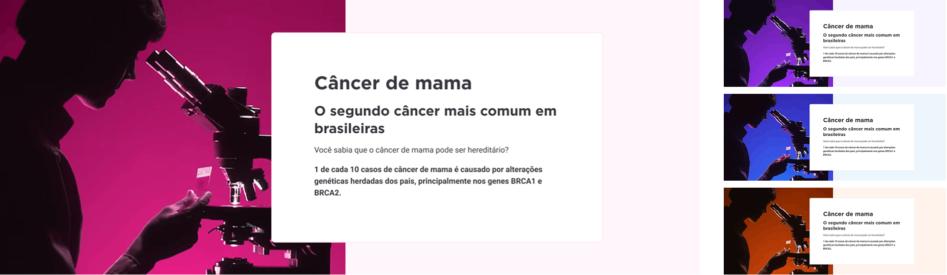
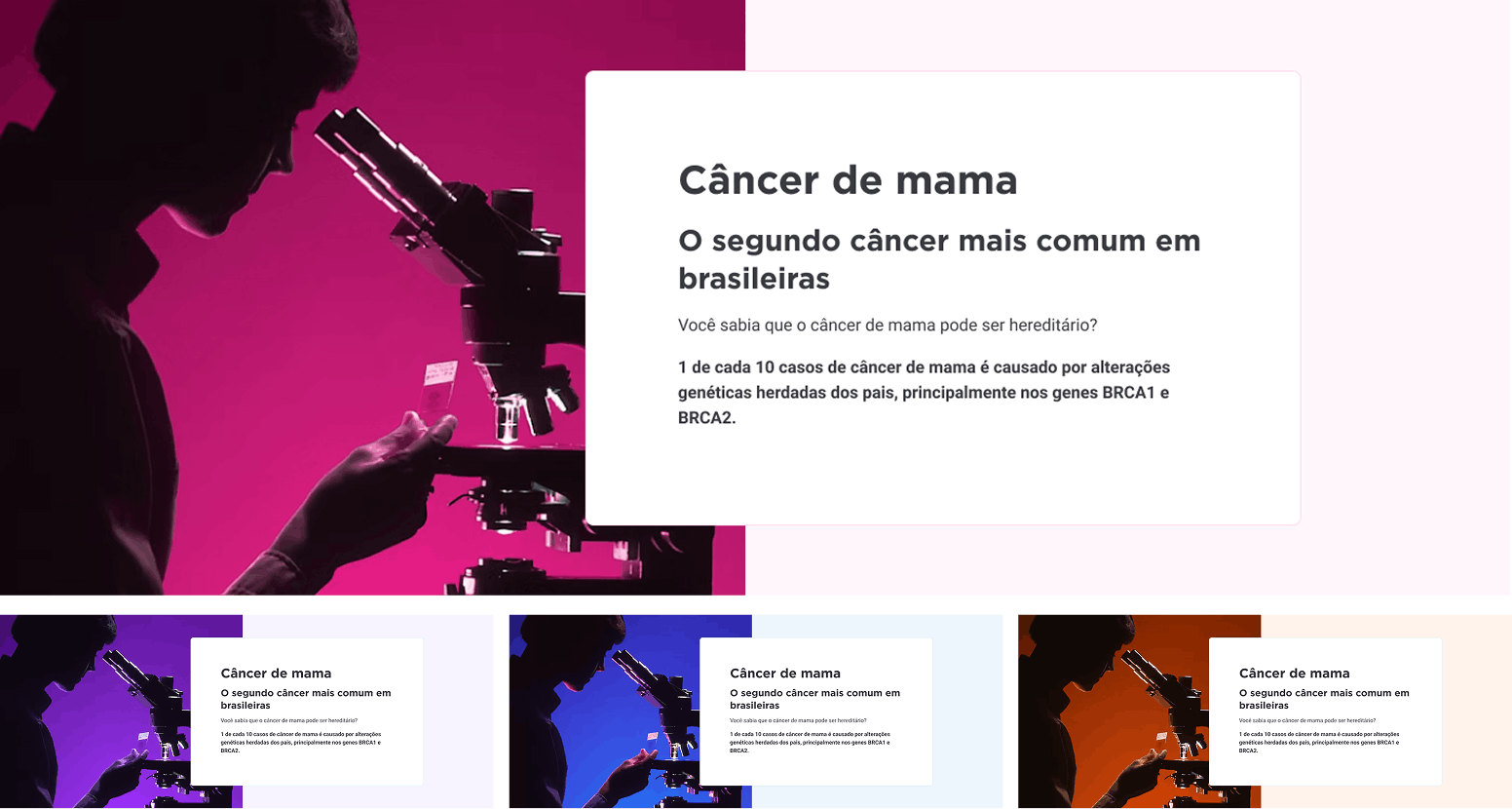
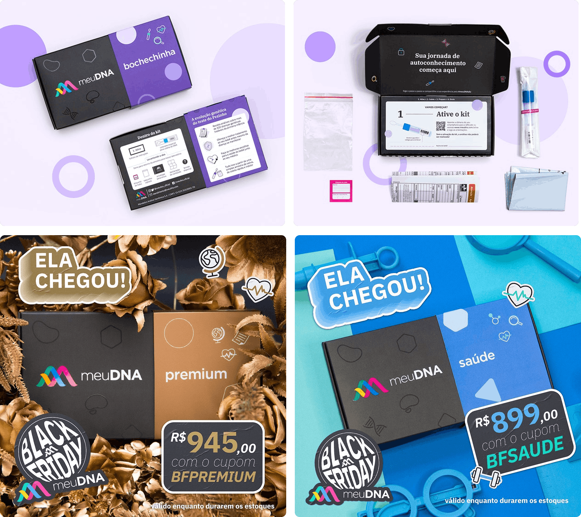
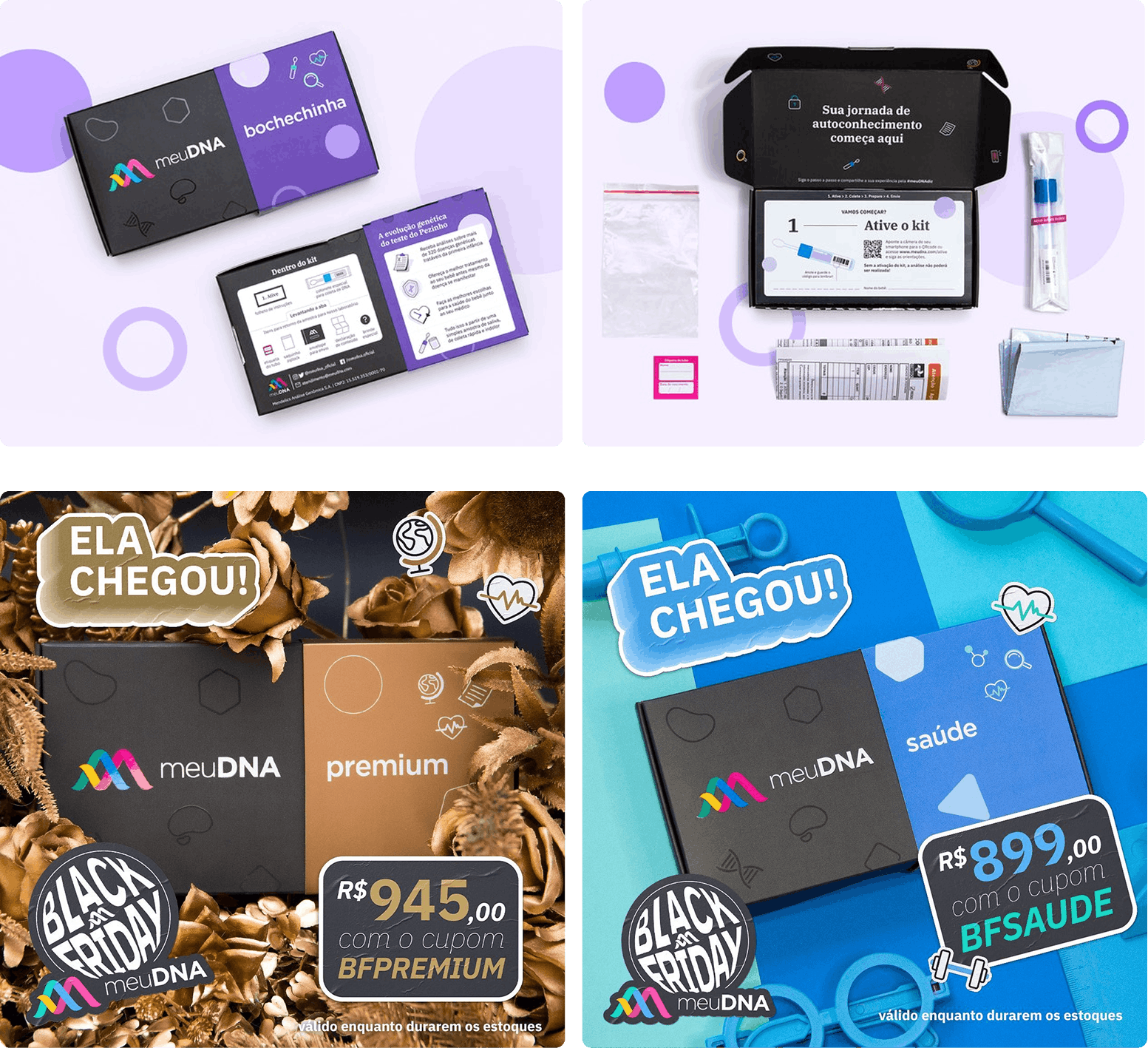
product photography was created to support both sales pages and marketing campaigns.
the images combine clean product presentation with staged scenes, including promotional compositions for seasonal campaigns such as Black Friday.